1. This would have been so cool!
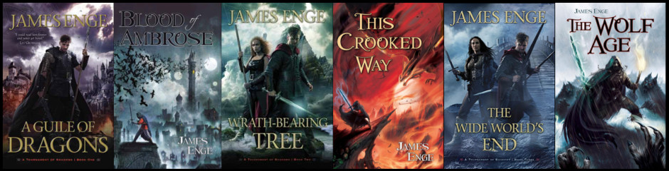
2. This actually is cool, at least to my somewhat unbelieving eyes: the full jacket for Blood of Ambrose. (Dominic Harman blogs a bit about the process behind the cover here.)
I like the echoes of the cover-painting on the back and spine, and the overall color scheme. Someone has suggested that brighter colors stand out more appealingly on a bookshelf, but (a.) I hope and think that’s not so, and (b.) I think the black-and-blue goes better with the feel of the book. Readers might be baffled by finding a sword-and-sorcery story in a package sparkling with “inexplicable splendour of Ionian white and gold.”
3. In my intensive campaign to avoid doing any sort of useful work, I’ve taken to watching some old episodes of The Avengers. Last night I watched “EPIC”, which may have the least plausible plotline of any show in the series (yes, I know how strong a statement that is) but is far from the worst. One scene shows Emma waking up in an exact replica of her apartment, and being shocked when she finds out she’s been kidnapped. The same thing happens, of course, to Patrick McGoohan’s character in the first episode of The Prisoner, which hit the airwaves five months later (says IMDb). Influence? Allusion? Coincidence? Some other explanation?
The jacket does look good. (I love the Keyes quote.)
–Jeff Stehman
Great covers and design seem to be part of the Pyr experience. It was fun to be in the loop on some of that stuff.
As opposed to, say, Ace. I was reading Locus’s recommended list for 2008. Brown recommended burning the dust jacket for Saturn’s Children.
–Jeff Stehman
Bah, sorry for the mess. It worked in preview.
The link worked in my email notification of your comment, too–just not in the comment itself. Weird. Oh well, LiveJournal works in mysterious ways, its wonders to underperform.
I know exactly what you mean, anyway: that’s one of those covers nobody wants to be caught reading on a bus. (The book itself is supposed to be an homage to late-Heinlein, which sort of boggles the mind in its own right.)
Gorgeous cover!
Thanks! (Not that I had anything to do with it except to say stuff like, “Cool crows!” after I saw the rough.)
I wish they had made that John Carter film, even though the tests look like crap. It would have made a modern version much easier to greenlight, since the modern film would be a remake of some geek’s beloved childhood memory rather than an adaptation of increasingly obscure books from ever more decades in the past.
And I love the cover. I especially love the little barb on the J in your name. It gives the letter a very Cimmerian scowl.
Well, to me the Clampett footage looks like pretty good first runs at animation (for the early 1930s). De gustibus non disputandum. But it kind of looks like Disney is going to make the Mars movie this year. Here’s hoping. I always complain about screen adaptations of my old favorites, but Burroughs isn’t exactly JRRT or UKL–her could definitely use some help with his dialogue and plotting.
Thanks for the kind words about the cover. It was a real privilege to see it take shape.
Disney is doing Barsoom? Say it ain’t so! They’ll destroy it.
And that’s a great cover.
Well, I don’t know. It’s not getting the 2D Pocohantas/Hunchback-of-Notre-Dame treatment: apparently they’re going for live action plus CGI, a PG-13 equivalent of 300. It might work, depending on the execution. Hope springs eternal in the Engean breast. (Someone in my flist will probably see sexual content in that platitude, but so be it.)
It’s not the animation I’m afraid of, it’s everything else. Music by Peter Gabriel? A villain named William Cecil Carter?
Maybe Disney will create it under to Touchstone and make a half decent flick.
We should all live so long.
I think skepticism is the healthy way to approach this kind of news, but I can’t say I’m that healthy. And I guess if the books themselves were better written I might be more worried. ERB had a great imagination and he stole from the best, but he was no Leigh Brackett when it came to style or storytelling.
I love the cover. The near-monochrome is really appealing. The contrast between the warm tones of Morlock’s tunic and the cool tones of the rest of the city focuses the eye on Morlock.
Plus, the architecture looks awesome.
Right! I was glad DH hadn’t plastered Morlock with the usual black-on-black-with-black-fittings getup. And the city is pretty impressive. I like that he got all three moons and the crows into the image, too.